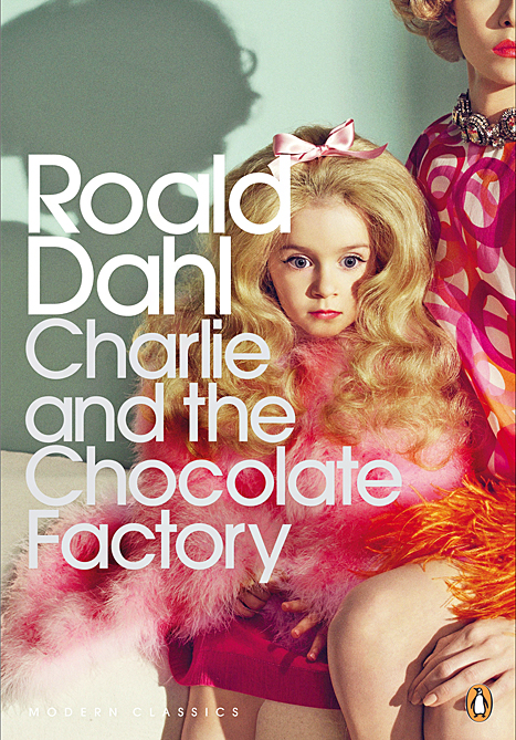
 Although the saying “Don’t judge a book by its cover” is supposed to be metaphorical, the controversy surrounding the new Penguin Modern Classics edition of Roald Dahl’s ‘Charlie and the Chocolate Factory’ suggests that many readers care about actual book covers quite a lot. Variously described as postmodern, sexualised, creepy and downright terrifying, the new edition of Dahl’s best-loved book released next month ahead of its 50th anniversary has provoked some very strong reactions from readers and critics this week.
Many have commented that the cropped image of a photograph taken by Sofia Sanchez and Mauro Mongiello which depicts a young girl with a doll-like expression wearing make-up wouldn’t look out of place on a cover of ‘Lolita‘ by Vladimir Nabokov. Penguin defended the cover this week stating that the image isn’t intended to represent either Violet Beauregarde or Veruca Salt, the main female characters in the story. Instead the cover: “looks at the children at the centre of the story, and highlights the way Roald Dahl’s writing manages to embrace both the light and the dark aspects of life”.
Indeed, many of Dahl’s books contain dark themes which Mark Sinclair writing for Creative Review magazine believes are reflected in the new design: “While the candy-colours hint at the sickly-sweetness of Willy Wonka’s confection, of more significance is the unnerving quality of the image which touches on one of the main undercurrents in the book: the relationship between children and their parents, and what can happen when fame and fortune enter into their lives.” Author Philip Ardagh, on the other hand, simply said: “I think it’s bollocks”.
Penguin have said they wanted to make a deliberate move away from Quentin Blake’s iconic illustrations widely associated with the popular children’s book and I think they have certainly achieved this. Apart from the connection with dark themes, the image seems to have been designed to be intentionally provocative and doesn’t appear to be directly relevant to the story itself in any way. Plain designs aside, it’s difficult to think of other covers which give no real clues about the content, genre or style of the book in the same way that this one does.
‘Charlie and the Chocolate Factory’ is one of a very small number of children’s books which are being reprinted as Penguin Modern Classics. However, while the Harry Potter books have more obvious crossover appeal between adults and children, ‘Charlie and the Chocolate Factory’ is widely viewed as a book solely for children. It is a story which is fondly remembered by adults but probably not one that is revisited until they read it with their own children – in which case, it probably won’t be this particular edition which they choose to buy.
It will be very interesting to see how many copies of the Penguin Modern Classics edition are actually sold once it is published next month and also how prominently it is displayed by the bookshops which choose to sell it. Although it has generated a lot of discussion this week, I think it may become something of a collector’s item – a copy which will be purchased for its memorable cover but less likely to actually be read.
What do you think of the new cover of ‘Charlie and the Chocolate Factory’? Do you judge books by their covers? What is your favourite book cover of all time?


I don’t like it, and I’m sure they’ve done it simply to court the kind of publicity they’ve succeeded in getting. It gives no sense of what the book is about – surely a cover should be relevant to the content in some way? It’s hard to see any good reason for doing this apart from publicity.
LikeLiked by 4 people
I don’t like it, I was taken aback by the cover when I spotted it on my feed. Why do they want to distance from Blake’s illustrations? Copyrights? Great call on the Lolita comparison, that would be an appropriate cover for that disturbing tale!
LikeLike
I try not to judge, but honestly it does affect what editions I buy. Having said that, I don’t think I want something that creepy on my bookshelf.
LikeLiked by 2 people
Oooh no I don’t like that cover at all! It’s creepy and eeek they look like dolls!
LikeLiked by 1 person
The new cover is atrocious. Roald Dahl wrote Charlie and the Chocolate Factory for children. It is no secret that he didn’t like many adults. As for Quentin Blake’s illustrations, they are often an essential part of the story. Of course, Blake was not the original illustrator for Charlie and the Chocolate Factory. Joseph Schindelman was the original illustrator for the US edition and Faith Jaques for the UK edition. Roald Dahl is probably turning over in his grave. I don’t even like the idea of Penguin Classics publishing a new edition of the work.
LikeLike
A creepy cover for a creepy book: seems reasonable. Although I might have chosen a different visual representation from the book to nail down the glorious creepiness of Willy Wonka and much of what Roald Dahl wrote to counteract the treacle that infests children’s literature and deadens children’s minds.
LikeLiked by 1 person
I entirely agree. Charlie and the Chocolate Factory is firmly a children’s classic in my book. Not one I might necessarily revisit but of course buy for my little niece – but not this copy! I find it attractive…creepy…but completely removed from what this book is…
LikeLike
Yes, I don’t find it quite as offensive as some people do but it is a very odd choice and doesn’t easily convey what the book is actually about!
LikeLiked by 1 person
I don’t think this cover is suitable for small children, but it does uncover some of the darker themes in Roald Dahl’s book. The doll-girl, sitting on her mother’s knee, is more reminiscent of those grotesque beauty pageants than Lolita. I don’t think it’s a sexual image, the girl’s expression depicts an accepted despair which adds depth to the female characters in Charlie and the Chocolate Factory, who are at the mercy of their ‘pushy parents’. The darkness of the image also hints at the disturbing nature of Willy Wonka’s barely concealed hatred of children. The doll-girl could be interpreted as the loss of innocence that repels Willy Wonka. I like the front cover. It’s subversive and interesting, although you could also argue it promises a depth that simply doesn’t exist in Charlie and the Chocolate Factory 😉
LikeLiked by 1 person
Yep – Lolita! i wouldn’t give a book with a cover like that to a child, and to be honest if I didn’t know what book it was, the cover would make me think it wouldn’t be suitable for me either!
LikeLike
Penguin had been asking people to guess which book this cover belonged to before they announced it. I’m not sure if anyone did guess correctly which kind of says it all really!
LikeLike
I think it is perfectly horrid and would not have it in my house. Ick.
LikeLike
the cover it’s terrible. I prefer all the other versions of the cover that I’ve seen, not only from penguin but from other editors. it’s supposed to be a children’s book (even tho I know that’s arguable) and I don’t think any child will see this book on a shelf and say “please mommy buy me this”. and probably the parent will not like it because if you don’t know the story or the autor it looks like a book about something very different
LikeLike
Yes, Charlie and the Chocolate Factory is a very dark book, about horrible children and their parents. But this horrible cover says nothing about the story and I would never buy it. The fact that Penguin says it’s not supposed to represent Veruca or Violet says a lot. It’s like someone said “find me a creepy kid picture” and this is what they picked. Not how I would choose a cover for a book, especially a classic.
LikeLike
Definitely agree – if the girl isn’t meant to be Veruca or Violet, then how can it represent the characters’ relationships with their parents? And what about Charlie?!
LikeLiked by 1 person
Initiate projectile vomit.
LikeLike
Wow, totally agree with the Lolita comparison. Yes, I am definitely judging this book by its cover. I do think that Charlie and the Chocolate Factory can appeal to both children and adults, but I just don’t think this cover would appeal to anyone.
LikeLiked by 1 person
I actually think it’s clever *ducks for cover* – I wouldn’t buy it for a child but I would (and probably will) buy it for my own collection. As someone who is familiar with the story, the image immediately identifies with a number of themes in the book.
LikeLiked by 1 person
This is not a children’s edition! It’s not designed to be given to a child – I also quite like the darkness it implies. Child-suitable editions are available.
LikeLike
I like the creepiness of it, the book is quite dark, but this is a publicity stunt. Which has worked. It is being talked about everywhere.
LikeLiked by 1 person
I hate the new Dahl covers I’m afriad. I understand what they were trying to do but I’m not sure they were successful.
My favourite cover? Not one favourite but many most of which are old Virago original green covers from their VMC’s of the 1980’s for instance I love the cover for Molly Keane’s Young Entry.
LikeLike
A very misleading cover. I wouldn’t buy this edition for a child. Whether we admit it or not, we are all sub-consciously influenced by book covers when we buy a book. Apart from the Lolita aspect (& I agree with the comments on this aspect) it’s wildly misleading in terms of the book content.
LikeLike
I’m deeply exercised by cover art at the moment for my own book. I think the Penguin Charlie (if you didn’t know it from the title), suggests a book about manipulation in the cosmetics industry, with nasty overtones due to wall-shadow and the cut to flesh reveal on the knees.
LikeLike
I think the big myth is that this cover is for child purchases. It obviously is to fit in with an adults’ shelf of MC editions and is accordingly creepy-camp. I suspect it’s been made to stir up interest on a book that probably sells no more or less than it ever did, and to spark adult repurchases.
Besides, the book is pretty wrong, ditto the film. A reread and reviewing of both from the last time I saw them (as a child) confirmed how adult the story really is.
LikeLike
I appreciate the style of the cover and the light/darkness they were trying to convey, but not that particular pose/model. The beautiful, yet vacant and empty-looking little girl kind of makes me uncomfortable.
LikeLike
That really does appear to be a strange cover for this book, and I really don’t see how it relates to it in any way. I’m sure, just as others have mentioned above, that it some attempt to garner some bit of publicity. Personally, I’m not impressed and feel they should have left it alone.
LikeLike
Well this is a surprising cover to say the least. I like my covers to be pretty but I wouldn’t buy this one. It’s obviously been designed for adults, even though I can’t see what the cover has to do with the story. Publishing companies insist on making arbitrary covers for all the wrong reasons. Obviously this one was designed to spark interest and sales. Nobody is going to buy this edition for a child. I wonder what the sales have been like? I wouldn’t buy it.
LikeLike